Watermarks are a big deal, especially for photographers. All too often, photographers will post an image online only to have it reshared without the proper credit. It’s tricky because as a photographer you want to show off your photography first and foremost, so you want to make sure you come up with a watermark that will be subtle, yet still effective.
Our previous post covered some of the most common watermark mistakes and what you can do to avoid them and create watermarks that look and work great. It is so important that you understand proper placement and design so that you can make sure people can find you, especially if they want to hire you based on an image that they see.
Since it can be a little bit tricky to get it right, we decided to share some of our favorite photographer watermark examples so you can visually see what we are talking about when we talk about some of the watermark “best practices.” We will also share why we love each of these watermarks so you can be inspired to create your own!
Are you ready to get started? Let’s dive into these examples!
PS: Want to create your own watermark in just a few seconds? Then click here and check out the Watermark app!
Keep reading to find out:
5 of the Best Photographer Watermarks
1. Daniel Salib Photography
Daniel Salib‘s work is beautiful, and so is his watermark. His watermark is white and subtle. It features his logo and his website URL so people can easily see his portfolio and get more information about his services. Another thing I love about the watermark is that it’s located in the bottom left corner. The bottom left and top right corner are the two optimal places for a watermark since people usually “read” images starting on the top left corner and down to the bottom right corner. Placing the watermark out of this “path” makes it harder for the watermark to get in the viewer’s way.
When choosing your watermark and where to place it, remember that you don’t want it to be so obvious to the eye and you don’t want it to get in the way of your picture. People who want to hire you will find you. They will put in a little extra work to find your watermark, so don’t worry too much about making the information prominent. Your main goal should be to make it discrete enough that it doesn’t get in the way of your artwork.

2. Pvtrx Fotografie
We really like Pvtrx Fotografie’ watermark. It’s discrete so it doesn’t distract or get in the way of the subject of their photos. People can still admire their photos without having to look past the watermark. As you can see, it’s a little transparent, which means it blends in perfectly with most backgrounds.

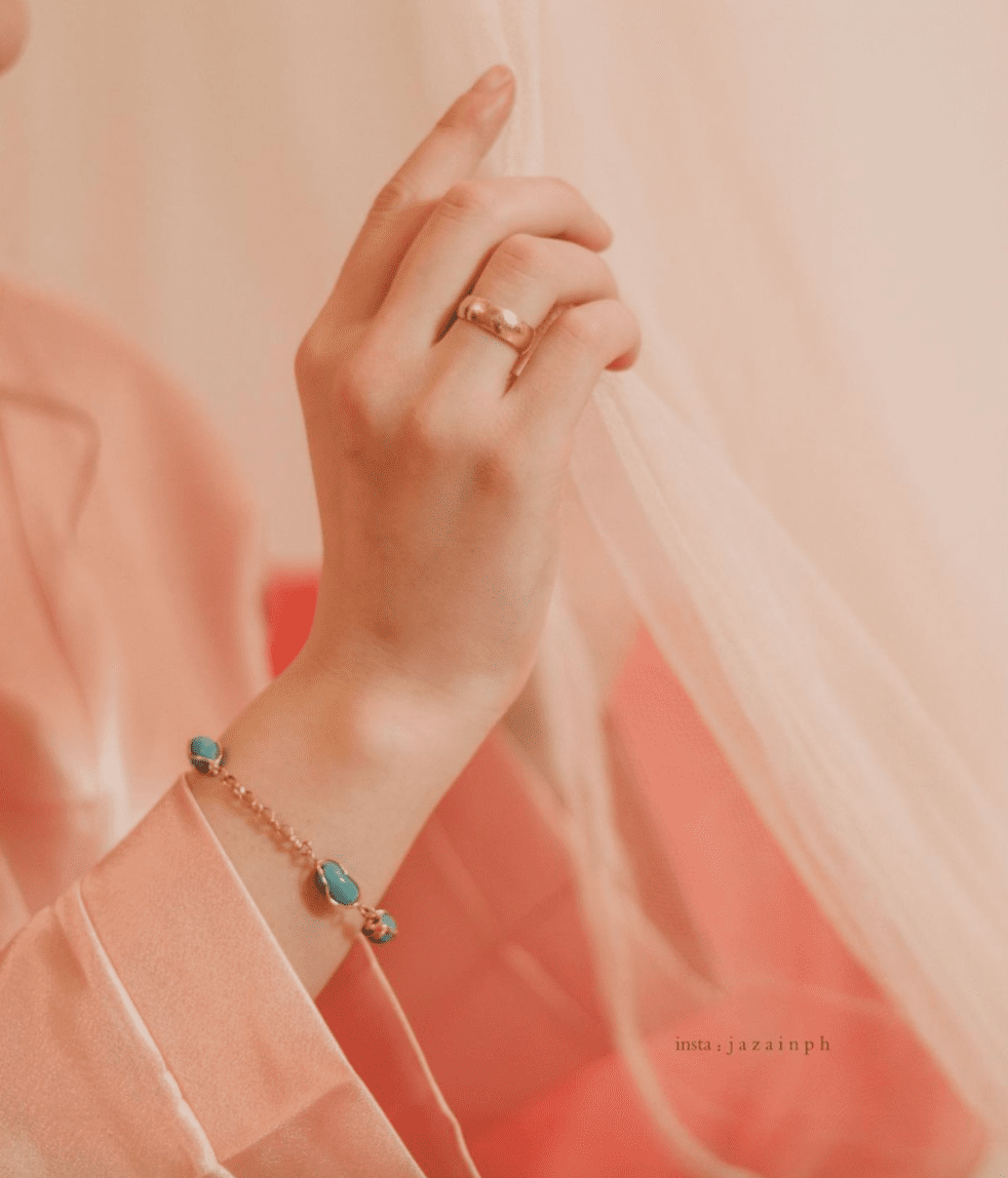
3. Jazain Photographer
We love how Jazain uses her watermarks in a delicate yet effective way. She tweaks it, sometimes using it in white, other times in black. She also varies the placement so that it’s never too attention-grabbing. Jazain is careful to never put the watermark in an obvious place – never too close to the subject or to a part of the picture that naturally draws more attention. Her watermark is simple and low profile, and it’s also very clear, showing just her Instagram username in an easy-to-read font. This makes it easy for people to find him on Instagram and see more of his work. Writing your Instagram handle instead of a logo is especially useful for those who have a common name which may be difficult to track down on Google.
4. Nataly Danilova
Oh, my goodness, how cute are Nataly Danilova‘s photos? I think they are simply amazing. But what we are focusing on for the purposes of this blog post is her watermark. Previously, we looked at some that were very discrete black and/or white options. Nataly’s watermark is a little bit different. Hers is more attention-grabbing because of both its size and color and guess what? It still looks really nice!
If you look closely, you can see that she actually matched the watermark color with a color from the photo. Since the tone of the photo is fairly warm, the yellow really blends in well and the effect is really polished and professional!
5. Darkmode Media
We really like the watermark that Darkmode Media is using on his photos. While he’s not a photographer (they’re a video and image editor), the idea is the same. He is doing a great job with his watermark because it is small, unobtrusive, and easy to read. Even though its placement still draws some attention, the watermark is small enough that it doesn’t make the picture look bad. And because the watermark is white, it’s not really that attention-grabbing.

Did you like these tips?! Then don’t forget to save the image below in your “Watermark Ideas and Tips” board on Pinterest! Also, check out our Pinterest page and follow us to get daily updates + digital marketing and social media tips for small businesses!
We can’t wait to see what you do. Please tag us using the hashtag #GrowingMyBiz so we can see and share your work!