If you’ve been posting pictures of your work online for a while, you probably know that watermarks are super important. In addition to protecting your work from theft, they also help people track down the person who originally created that piece of content, product, or service.
However, creating the perfect watermark might be challenging if you don’t know where to start. In a previous post, we shared some common watermark mistakes people tend to make and showed you how you can create your own watermark easily and without expensive or complicated design programs.
If you’re a nail artist and you’re still struggling to think of the best way to design a watermark, don’t panic. We are here to help you. In this blog post, we are going to share some real-life examples of great watermarks by nail artists that are sure to inspire you as you create your own. For each watermark in this list, we will tell you exactly why we love it so you can better understand how you can apply the same tips to yours.
PS: Want to create your own watermark in just a few seconds? Then click here and check out the Watermark app!
Alright, let’s dive into the list!
Keep reading to find out:
8 of the Best Nail Artist Watermarks and Why We Love Them
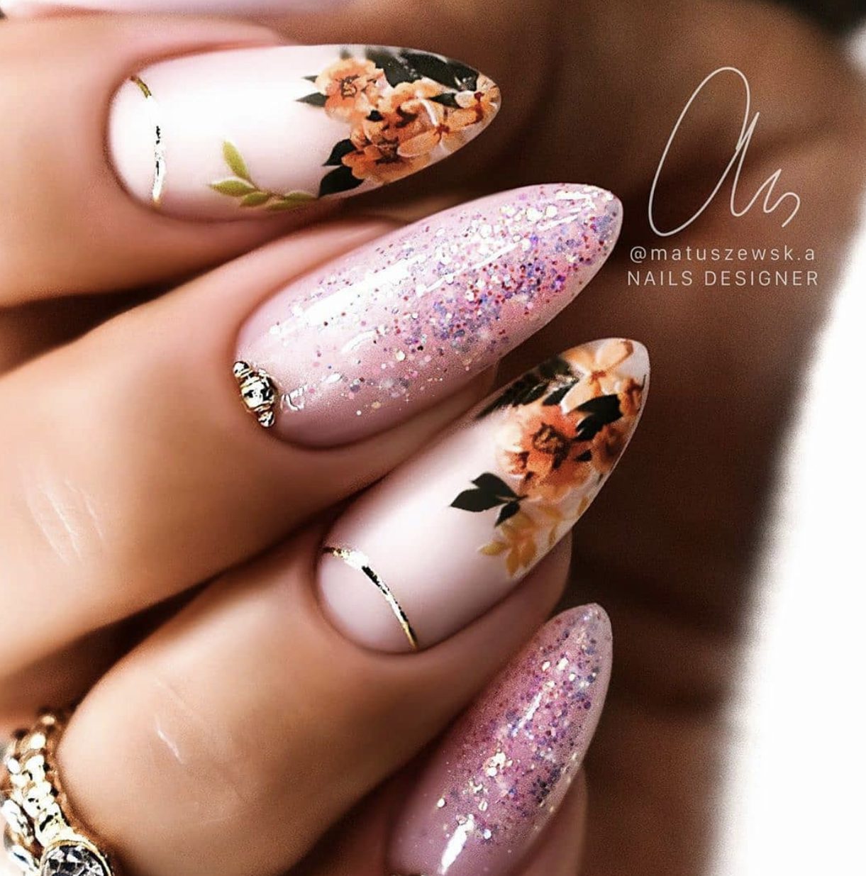
1. Karolina Matuszewska Nail Artist
Karolina Matuszewska‘s watermark is so beautiful. The signature-like design makes it look ultra sophisticated and adds a personal touch. But the best thing about it is that in addition to the signature, it also includes her username on Instagram. Without this, it might be difficult for people to track down the image’s origin.
Another thing we love is that the font is really easy to read so people can clearly see what is written there. We also love the fact that she positions the watermark in different places within the picture so it doesn’t get in the way of her work. Watermarks shouldn’t draw too much attention and you want to make sure they’re never preventing people from seeing your content.
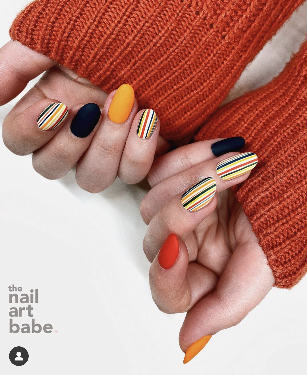
2. The Nail Art Babe
We love The Nail Art Babe‘s watermark because it’s simple, easy to read, and minimalist. It’s modern and elegant at the same time. We also like the fact that the watermark is not completely black, it’s a shade of gray that’s softer against the background, causing it to be more discrete.
Apart from that, the watermark is positioned in the bottom left corner, which naturally doesn’t draw too much attention. The corners that people tend to look at first are usually the top left and bottom right corners. In this case, not drawing attention is a positive since you want to make sure the first thing people see is your work, not your logo.
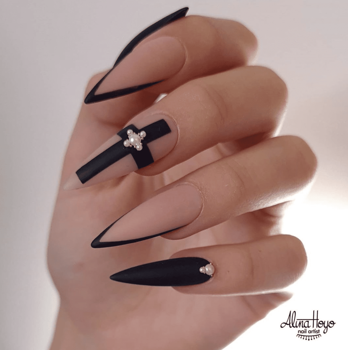
3. Alina Hoyo Nail Artist
Alina Hoyo‘s watermark is super cute! Even though the font is a handwritten style, it’s still easy to read. If you are going to design a logo for your small business, you want to make sure that the font you choose is easy to read since you want people to be able to read your name so they can look you up. Handwritten fonts are really trendy, but some of them can be tricky to read and you definitely don’t want any additional barriers between you and your potential customers.
Alina Hoyo’s watermark is also positioned in the bottom left corner, which, as we mentioned before, doesn’t draw too much attention away from the nail art in the picture.
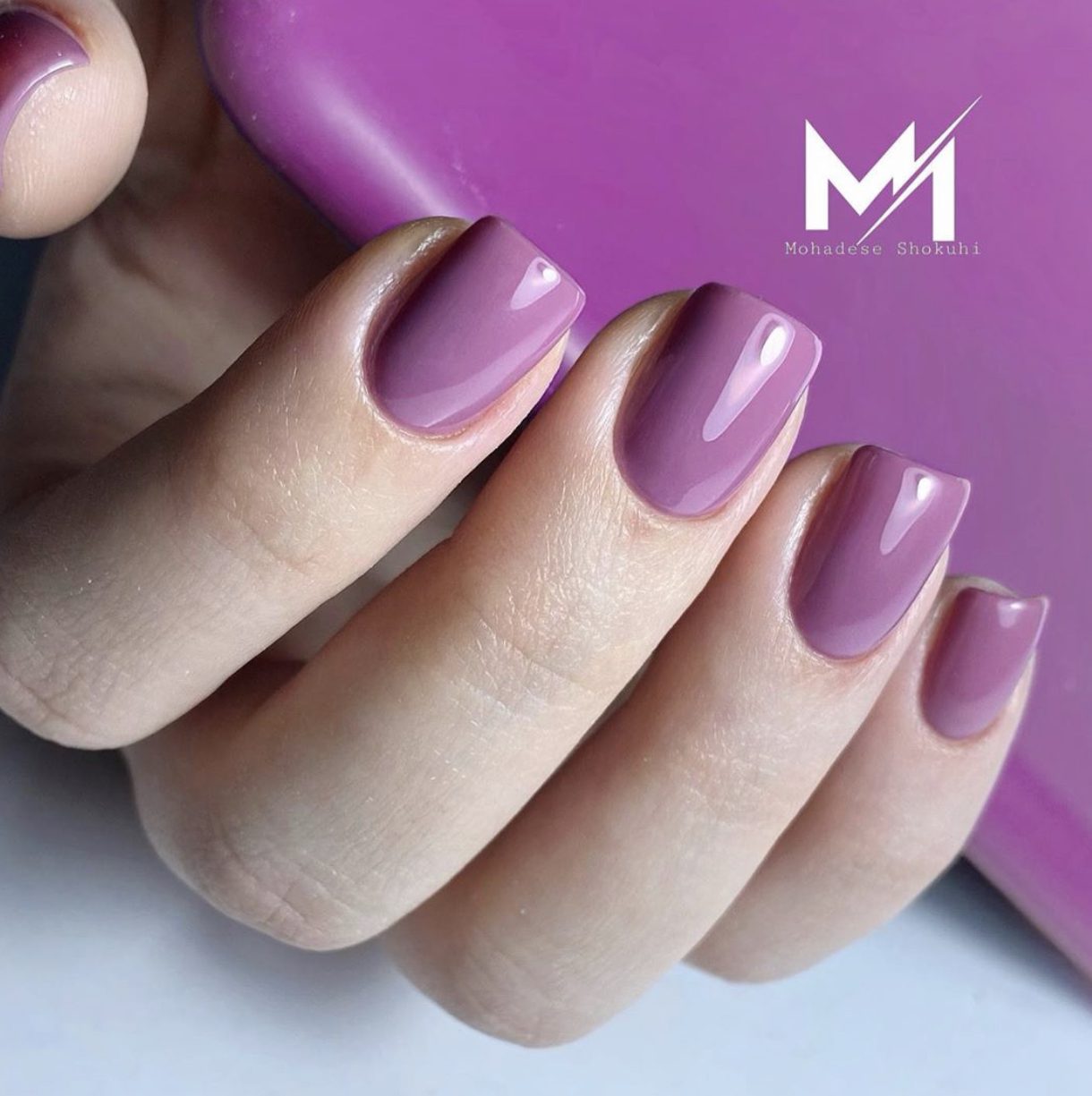
4. Nails by Mohadese
Nails by Mohadese‘s watermark is nice and simple. It looks modern and it includes her full name, which is her Instagram handle as well. This makes it easy for anyone to find her.
What we like about her watermark is that she plays around with the placement in the picture, as well as the watermark’s opacity and colors.
She uses black or white on her watermark so that it blends in with the background. This also helps keep it a little more discrete since these colors usually don’t draw too much attention.
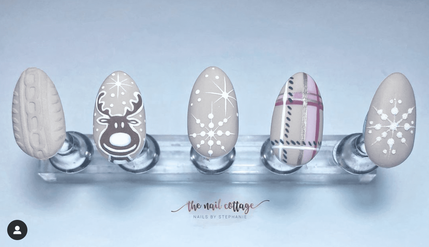
5. The Nail Cottage
Don’t you think The Nail Cottage‘s logo is so freaking cute? Again, this is another handwritten font that is easy to read, and we love to see that. The gold color in the watermark makes it different and a little more polished.
She places the watermark in the center of the photo, toward the bottom. This is a great position for your watermark (as well as in the top center). We love that she uses the same watermark as the profile picture, which makes it easier for users to identify her profile when looking for it on social media!
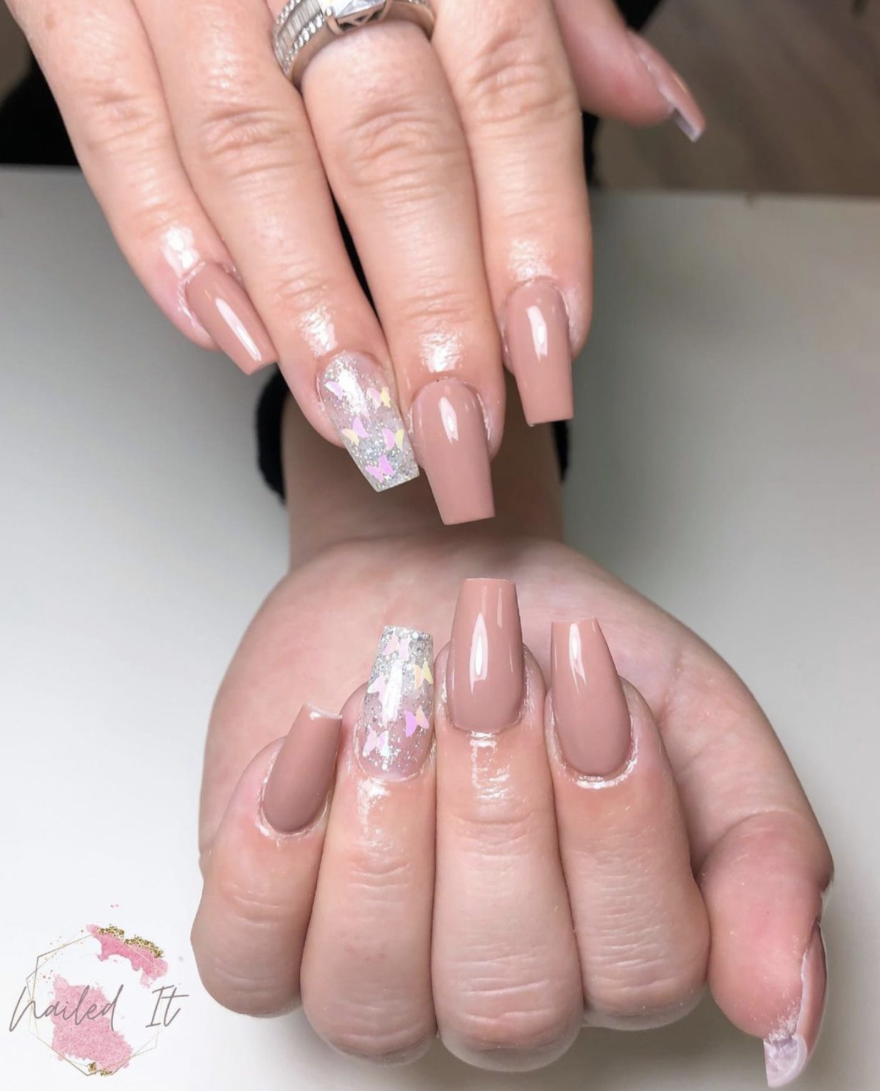
6. Nailed It Nail Salon
Typically, colored watermarks tend to draw a little too much attention away from the photo, but this is not the case with Nailed It Nail Salon‘s watermark. It’s pink and gold, but it’s still discrete and delicate, and she positions it in the bottom left corner, which is a low profile position.
She uses the same logo as her profile picture, just like The Nail Cottage. Even though the name is a little broad (Nailed It), when you look for it on Instagram, it’s easy to know which account is hers because you can see the matching logo in her profile picture.
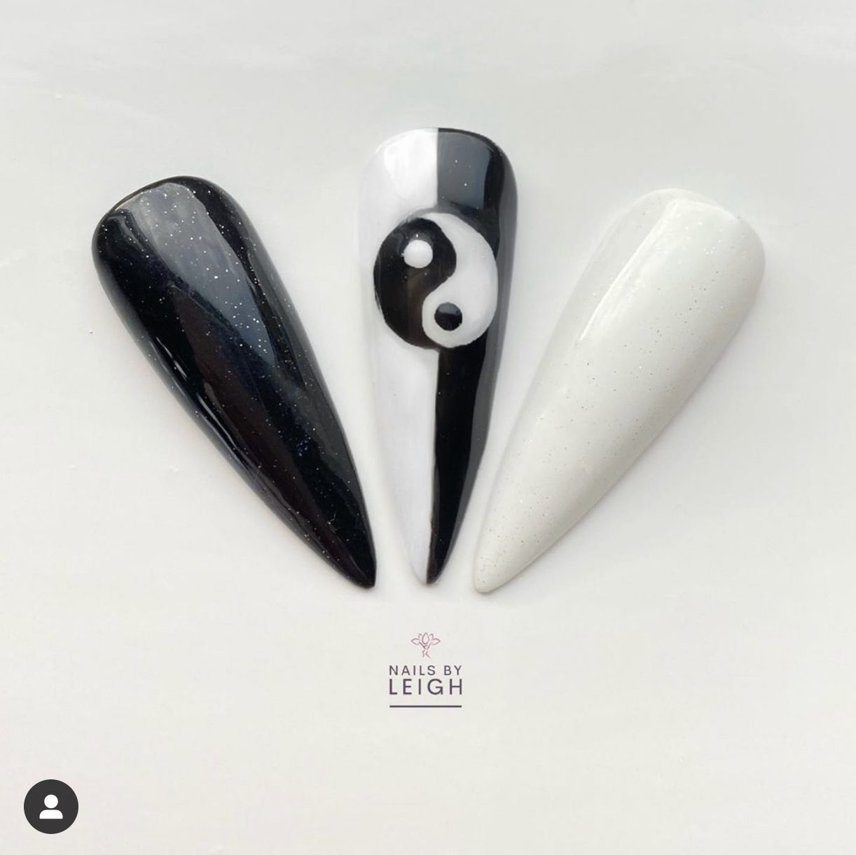
7. Nails by Leigh
Nails by Leigh‘s watermark is another example of a colored watermark that is super cute and discrete. It’s proof that to be unassuming, it doesn’t necessarily need to be just black or white. Here, the size and the type of font also matter. The font is simple – sans serif – and easy to read. The watermark’s size is in that sweet spot. It’s not too small that it’s hard to read and it’s not too big that it ruins the picture.
8. Belissima Funchal
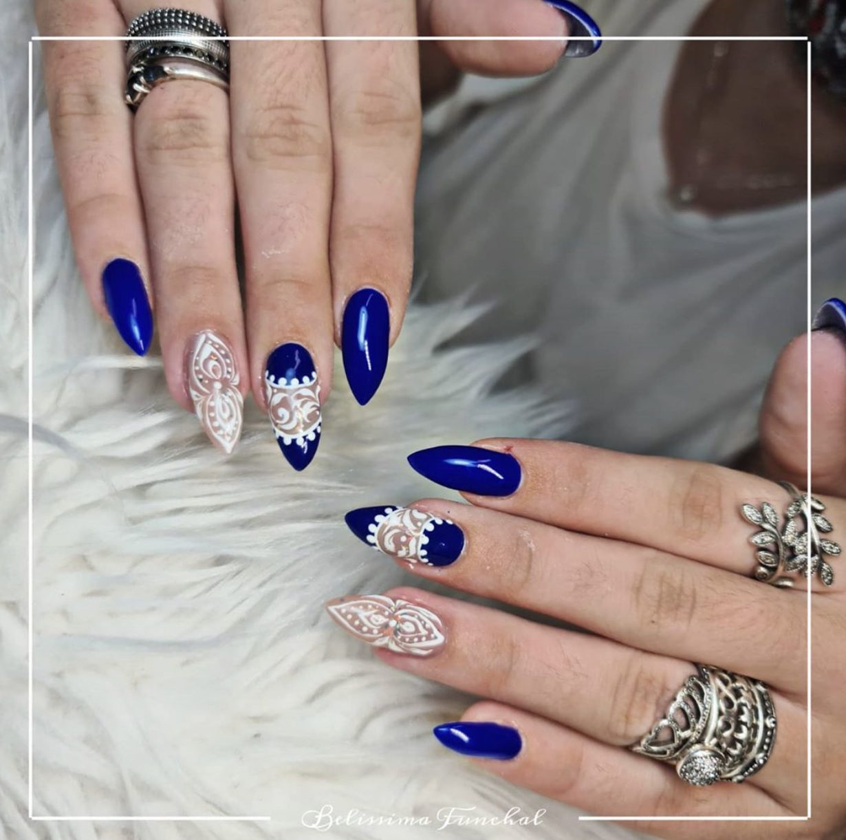
Belissima Funchal‘s watermark is simple; their logo is just their business’ name in a handwritten font that is super easy to read. Their pictures are usually bright and, therefore, the white watermark is the perfect compliment. And, because their photos are so consistent, the watermark blends perfectly.
In a lot of their photos, they add a thin white box to their photos, which actually makes their watermark look a little more elaborate. It’s a nice way to emphasize the watermark without making it the focus of the photo and it mixes things up so the feed doesn’t ever look boring. If you’re going to do something in a similar style, make sure you use a very thin line and a discrete logo, otherwise, it runs the risk of overwhelming the photo and stealing the spotlight. You want your nail art to shine above all else!
Did you like these tips?! Then don’t forget to save the image below in your “Watermark Ideas and Tips” board on Pinterest! Also, check out our Pinterest page and follow us to get daily updates + digital marketing and social media tips for small businesses!
We can’t wait to see what you do! Don’t forget to tag us using the hashtag #GrowingMyBiz so we can see and share your work.