
Most small business owners are not designers. In fact, I’ll bet this is the reason you searched for an article like this! You don’t know how to design a logo yourself, but you’re also not willing (or able) to pay for a professional logo right now. Sound familiar?
Don’t worry. Designing a logo from scratch isn’t impossible. Rather than try to go without one, I’ll show you how you can create a polished and professional looking logo for your small business in no time.
If you want your company to grow and if you want it to be taken seriously, you need to have a good logo. Of course, it’s just a small part of your brand’s visual identity, but it is a very important part of it. It helps you make a strong first impression and it helps connect people to your business on an emotional level. For example, how many times have you seen the Starbucks logo and instantly wanted a latte? Logos are pretty powerful.
Basically, what I’m saying is you don’t want to skip this step in building your small business. You need a logo that will last and grow with your brand. Give it some thought and make sure it is something that really fits your company and that you’re proud of it.
I know you want to go cut the small talk and go straight to the logo design part. However, there are a few things you need to consider before you can start. Are you ready?
Keep reading to find out:
What Is a Logo?
Before we even start talking about logo design, I want to make sure we are on the same page about what a logo is, first. Put simply, a logo is a symbol (made up of a combination of text, images, shapes, lines, etc.) that identifies your brand.
A logo is a way to tell your audience something about your business. It’s a simple and concise way to represent your company’s “soul” without having to say a thing and it’s a fundamental part of your branding strategy.
Get Some Inspiration
One of the most important steps when you sit down to create a logo is getting inspired. Creating something out of the blue is overwhelming, so take some time to gather some inspiration first!
I don’t mean only looking at other businesses’ logos, either. Of course you’re going to do that, but you should take it a step farther. For example, let’s say you’re opening a hair salon. How do you want your customers to feel when they walk through your doors? What kind of feeling do you want your brand to evoke?
Say you want your salon to be glamorous and exclusive. You could do some research or even just think of the colors that make you feel that way. High-quality work, elegance and exclusivity always make me think of black, white and gold. Maybe these are some of the colors you could utilize in my logo.
You’ll want to do the same thing with symbols. Your logo can be just be your company name if you want, or you can add symbols and other elements that are related to your brand and the work you do. Back to the hair studio example, if you want to open a salon that’s just for kids, you could include a pair of scissors in bright primary colors as part of your logo.
As you’re doing this research, I encourage you to search online for articles about color psychology before you settle on the color palette you’re going to use in your logo.
Colors can invoke a strong reaction, even subliminally, so you will want to choose carefully.
Another thing that might help is to start a secret Pinterest board where you will gather all sorts of visual inspiration for your new logo. You might pin images that bring up strong feelings when you look at them, or something that incorporates the colors you’re most interested in.
As you do that, follow these four steps:
1. Write Down the Main Characteristics of Your Business
Think about your brand as if it were a person and list its characteristics. Come up with an idea around your brand by association. So create a list of things you want to people to think when they think about your business. Some examples of words you might write down are light, fun, happy, elegant, exclusive, classy, friendly, warm, welcoming, freedom, peace, etc. Think about what you want your business to be like and how you want it to be seen by your customers. This will help you zero in on the perfect logo once you get to that stage in the process!
2. Create a Moodboard
Instead of creating a moodboard full of logos, try creating one that just has visual references that you are drawn to. Create a secret board on Pinterest (it’s free!) to store all of your inspiration. If you get stuck, try searching for the words you wrote down in step one. Your search results might include a piece of fine jewelry (elegant, classy), blue skies with soft clouds (peace, lightness), a kid running in the fields (freedom, happiness) or a light bulb (innovation, creativity). Gather all of the images you love, even if you don’t know how they’re going to help with your logo. They will help. Trust me.
3. Mix it all together
Once you have the words and the images, try to narrow it down to a few that represent your brand the most. Which images and words that convey what you imagined for your company? This step will help you visualize what your logo design might look like, or at least the initial version of it (yes, you will create many versions and variations before you settle on a final logo design, but more on that later).
4. Doodle
This is the fun part! Even if you’re not much of an artist, you can start to transform your ideas into actual sketches. Instead of going straight to your computer and opening a design program, try to doodle your logo first the old fashioned way with a pencil and paper.
Don’t be afraid to play around. No one is expecting your first doodle to be the final product. For example, if your company’s name consists of two words, alternate making one of them bigger and the other one smaller. Try placing the words in a circle, side by side, or in another different fun way.
As you doodle, you should start to develop a clearer idea of the general look you’re trying to achieve with your logo, or at the very least, you’ll eliminate some ideas that don’t work out the way you imagined they would.
Look at Your Competitors
Looking at your competitors for logo inspiration is also important. You’re going to copy them, but you can understand a lot about logo design (both positive and negative) by studying what they did and noticing how you respond to it.
Look at businesses who have a similar audience and who you consider successful. Let’s say you are opening a coffee house and there’s a trendy coffee house in the town next to yours. What does their logo look like? What colors are they using? Are they using text only or do they have other design elements in their logo? Is the style of their logo trendy, classy, playful or vintage?
As you do this, see if there’s anything you can bring to your own design. Just don’t copy. Be creative!
How to Design a Logo?
Now that you’ve analyzed your competitors and defined your brand’s characteristics and visual aspects, it’s time to move onto the design. In this section, I will break down the steps to help you design a logo for your small business, even if you’re not a professional designer.
1. Choose the Right Type of Logo
As you know, there are different types of logos. There are some that are just an image, others that are the name of the company. It doesn’t matter what kind of logo you pick, there’s just one rule: keep it simple. Straightforward, uncomplicated logos are always best.
Pictorial (or logo symbols)
These logos are represented by an image alone and are often used by bigger companies. Images don’t need translation and these logos become a symbol for their brand that can be easily identified everywhere, even if you can’t read the language. How do you find a McDonald’s in Japan, for example? By looking for those yellow arches!
Even if your small business doesn’t plan on going global, you can still create a pictorial logo that conveys a specific feeling or message to your audience.
Examples: Shell, Apple and Twitter
Monogram (or lettermarks)
Monograms are often used when the name of the company is too long or if you just want to abbreviate your business name in a cool way. Whether the business has your own name or you come up with a different name altogether, you can easily design a custom logo that includes a monogram.
Examples: New York Yankees (with its famous NY symbol), LG (an abbreviation for Lucky-GoldStar) and H&M (that stands for Hennes & Mauritz)
Wordmark (or logotypes)
This is probably the easiest way to create a logo design using just your company name. Just make sure the name isn’t too long, otherwise it might not work as well.
Also, think carefully about the font style you want. If your brand is supposed to be light, simple and peaceful, a heavy-looking font might not be the best choice.
Examples: FedEx, Google and Tiffany&Co.
Mascot
A mascot was more popular back in the day, and some traditional brands still like to go this route. If you have a family-friendly brand, this might be a good choice too as a fun mascot can attract both kids and adults.
Here’s my one tip for this one: don’t pick any random mascot. Instead, think about something that actually makes sense for the services and/or products your company offers.
Examples: Bic, Pringles and Michelin
Combination
This is pretty self-explanatory; it’s just a logo that contains a combination of two or more of the logo designs listed above. Usually, combination logos combine two different logo types. Anything more than that might be too busy.
Some brands like to use just a pictorial image when in their marketing, even though their full logo has a wordmark as well. This kind of design gives you options and flexibility, which is fun if you feel like you’re going to want to play around with it a little bit.
Examples: Dominos, Starbucks and Amazon
2. Choose the Right Font Style
Now that you have the design figured out, it’s time to choose a font style that you like. Be careful because choosing the wrong font might ruin your entire logo.
There are so many options out there when it comes to fonts, so it’s pretty easy to get overwhelmed. Don’t worry, I’ll help you. Let’s take a look at the different types of fonts and what are the best ones to use on your logo design!
Signature and Handwritten Fonts
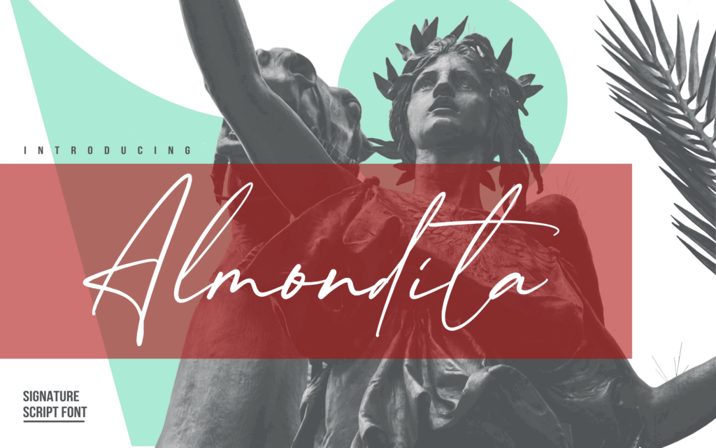
A lot of people are using signature and handwritten fonts for their logos these days because they look super unique. It’s not just the Times New Roman font we’ve all seen a million times. These kinds of fonts look more authentic because it looks like something you created yourself.
Signature fonts are a great option for small businesses, especially if you’re using your own name for the brand. It will give your business a personal but refined touch. Specifically, this is great for artists, photographers, lawyers, and salons!
Just be careful when you pick a font because some can be difficult to read. You may not want to use this kind of font as the brand’s main font. Consider pairing it with another one that is easier to read so you can use your signature font just as an accent piece.
Handwritten fonts, on the other hand, usually have a more casual look. For someone who is not very familiar with design, these two types of fonts might look pretty much the same. However, handwritten fonts tend to look more informal than signature fonts.
Handwritten fonts are a great choice for brands who want to target a general audience, like a coffee shop, restaurant or boutique store, for example.
Monogram Fonts
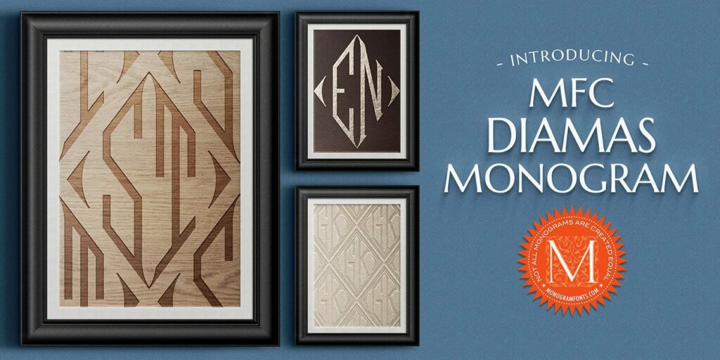
As the name says, monogram fonts are a great option to design monograms. They are a specific kind of font that usually includes more details and flourishes and has a look of being overly “designed” and elegant… think something along the lines of a traditional calligraphy font.
Vintage Fonts
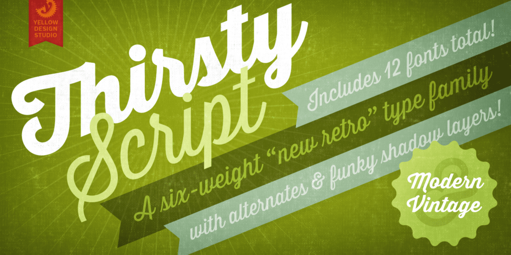
Picture a classic movie poster from the 1940’s and you’ll be able to imagine what a vintage font looks like.
Vintage fonts are perfect for brands that have a throwback vibe to them. For example, if you’re opening a traditional vintage barber shop, cocktail bar or coffee shop, this might be the perfect font to choose as you’re designing a logo.
Decorative Fonts
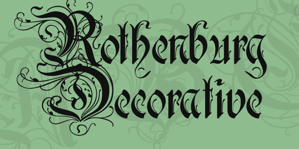
Different from the other types of fonts I mentioned before, decorative fonts are a pretty broad category of font. There are several styles to pick from, so do some searches to see what you’re most drawn to. These kinds of fonts are also the hardest to work with because they can compete with whatever else is happening in the design.
So, when designing a logo using decorative fonts, make sure you’re not only using decorative fonts. They should be used sparingly and with caution.
A good way to use decorative fonts is to use it for just one word of your logo and balancing it out with a very basic, simple font for the other words.
Sans-Serif Fonts
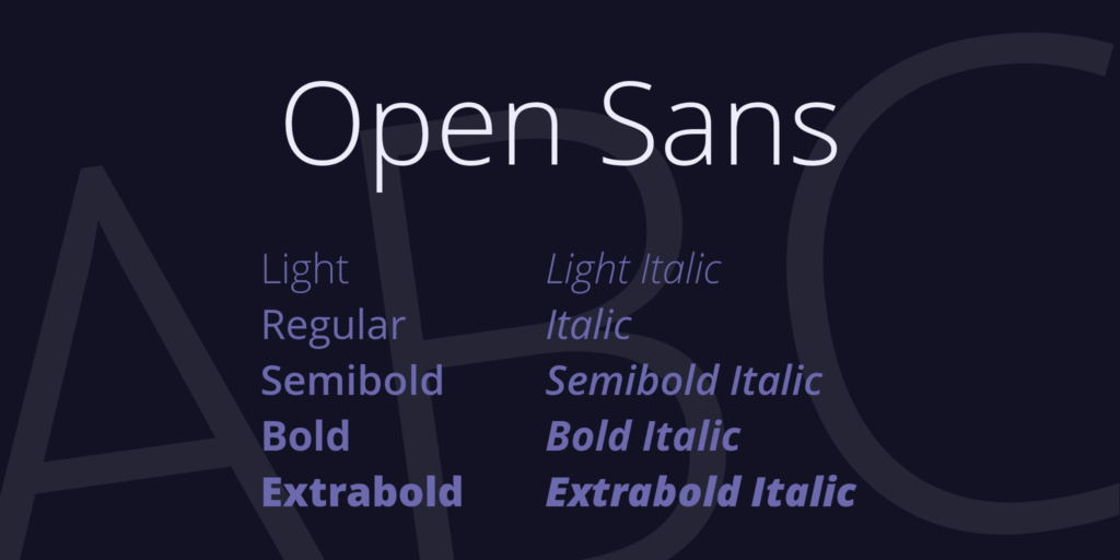
Sans-serif fonts are the ones that don’t use serifs in the end of each character. What does that mean? You know those tiny lines at the ends of the T when you use Times New Roman? Those are serifs.
These kind of fonts are simpler and go well with more elaborate fonts. They are also a great choice to design a minimalist logo. After all, your logo doesn’t need too many details to be good, it just needs to be beautiful. Sans-serif fonts are perfect for making a logo that looks sleek and modern, yet classic.
Pro Tip: Use Two Fonts on Your Logo
Using just one type of font has worked well for some well known brands like Samsung, Microsoft and Facebook. But, it does have a tendency to look a little bit boring.
If your company’s name consists of more than one word, try playing around with different fonts. You don’t have to use two fonts. Sometimes it might be too much. But, you could try making one word bold and the rest regular.
Or let’s say you’re creating a brand named after your own name, like Christina Campbell Nail Artist. You might want to us a stylish font for the “Christina Campbell” part and a smaller and a simpler font for the “Nail Artist” part.
If you need to get some inspiration on how to mix fonts as you create your logo design, you can take a look at this post from weloveitbut.com. Here you will find some font combinations that can help you as you design your logo.
3. Choose the Right Colors
Go back to the mood board you created with images that represent the characteristics of your brand. You can pull colors right from the image to use in your logo. However, let’s be honest, if you’re not a designer, chances are you’re going to be second-guessing your choices a lot.
Good news! There are some online tools that can help you choose with confidence. For instance, you can take your favorite inspiration photo and upload it in this fantastic tool created by Coolors and Skillshare. The tool processes the nuances from the picture and displays a color palette for you. You can lock in the colors you like and hit the spacebar to automatically display a range of other colors that compliment the color you’ve chosen.
Just remember, you don’t need five different colors in your logo. Try to stick to two or three at the most. Otherwise, it might just be too much.
Once you’re done picking the colors, you are ready to start designing your logo!
4. Design Your Logo
Designing a logo is much more about strategy and planning than it is about actual graphic design.
Most people go straight to this step, but I truly believe that you’re only going to be able to design the perfect logo if you’ve done some research and quite a bit of planning beforehand.
Don’t forget, a logo is just ONE part of your brand’s visual communication. The colors you select, the fonts you choose, it all contributes to your brand’s identity. You’re not just going to need all of these fonts and colors for your logo; you’re also going to use them on your website, email signature , social media posts, and all your other printed materials as well.
3 Ways to Create Your Logo
Software for Non-Designers: Photoshop
There’s a lot of specialized software out there to help you design your logo. However, most of them are expensive and used by designers only, which makes them super complicated for normal people like you and me.
Photoshop is far from being simple, but many people are at least a little bit familiar with it so I decided it would be a good one to start with. There are lots of good tutorials on Google and YouTube that tell you how to design a logo on Photoshop, too.
Before you start, though, you might want to first create a document where you’ll have all your brand’s colors (from the color palette you’ve built in step #3) and your logo elements. There, you can keep different logos (like the pictorial only version and the pictorial + wordmark version, for example) as well as different fonts you use for your brand.
This can be an editable file (in .psd) so you can always come back to it and make changes if you need to.
Online Software: Canva
Canva is free and it’s extremely user-friendly. It can work incredibly well as a free logo maker, even if you have no design experience whatsoever.
One of my favorite features is the “logo layouts catalog.” There, you can browse and choose from a library of pre-existing layouts. However, if you already have something in mind, you can also just start from scratch.
The pro (paid) version of Canva also makes it easy to create a color palette and save it so you don’t need to search for your brand colors every time you start a new project. With the Pro version you can also save your brand’s fonts and upload them. However, this is not essential if you’re just starting out. You can do just fine without the pro version.
Another feature I really like on Canva is the elements library. Remember I told you to identify images that convey your brand’s characteristics, message and values? In this library, you can search for related elements and use them as part of your logo.
If you want to have another logo option (one with a white background and the other with a black background, for instance) you can duplicate the image and change the colors with just a few clicks.
Once you’re done, you can download it as a .png, .jpg or .pdf. It’s a great way to design a simple, easy, and free logo!
App: Salt Logo Maker
The easiest way to design a logo is to use an app like Salt Logo Maker. Apps like this are very intuitive. In fact, even if you’re not a pro and don’t understand much about design, you can make a logo in just a few minutes!
The app has a gallery with more than 2,500 logo designs and they’re all categorized, for example, they have yoga logos, real estate logos, and so on.
After you choose one you like, you can adjust it with easy-to-use tools and you can pick a different font (there are more than 100) and select your colors, opacity, background and much more.
Another cool feature is that you’re able to select icons to use in your logo. There are more than 10,000 options between all of the categories. The app has amazing templates for social media as well. So once your logo is done, you can use it to craft your social media posts. The app has a free trial period of 3 days, so you can take a look to see if it will work for you before committing.
Is Your Logo Design Ready?
A quick but important reminder before you share your logo with the world: your logo is not your brand’s identity. It is just one part of it. When done right, it should convey your values, be recognizable, and make your brand stand out.
However, when people think about how to design a logo, they often forget a few details that will make their logo remarkable and timeless. To ensure your logo is really conveying everything you want it to, ask yourself these questions:
- Is it unique or does it look like other logos from your niche?
- Is your logo speaking to your target audience?
- If people look at my logo, will they immediately know what my brand is about?
- Is it simple and easy to remember?
- Is it versatile? Can you use it in different situations (posts on social media, blog posts, printed material, etc.)?
- Is it an evergreen logo or is it something that is trendy and has an expiration date?
Try to ask yourself these questions and decide if you should spend more time on your logo. Show it to some people who are close to you and ask them how they feel when they see it. Do they like the colors? Is the font easy to read? What about the elements you’ve selected?
Listen to your thoughts. If what you’re feeling and hearing makes sense, it’s time to go back to the drawing board and make some adjustments! Don’t become too much of a perfectionist, though. Nothing is ever going to be 100% perfect and stand the test of time forever. If you feel good about your logo, go ahead and share it so you can move forward and take on the world!
Read more: How to Make a Watermark: a Step by Step Guide
Did you like these tips?! Then don’t forget to save the image below in your “Logo Tips and Inspiration” board on Pinterest! Also, check out our Pinterest page and follow us to get daily updates + digital marketing and social media tips for small businesses!
We love to see your businesses succeed. Leave a comment and share your story with us, especially if you used this article to create your logo!
Like!! Really appreciate you sharing this blog post.Really thank you! Keep writing.