In a previous post, we talked about how to create a watermark and we shared some of the most common watermark mistakes we see people make. Now, we thought you might like some inspiration to help you create the perfect watermark for your brand.
We’ve selected five of the best restaurant watermarks made with the Watermark App. We’re going to tell you exactly why we love them and give you some tips to apply these best practices to your own watermark. Ready? Let’s dive in!
PS: Want to create your own watermark in just a few seconds? Then click here and check out the Watermark app!
Keep reading to find out:
5 Best Restaurant Watermarks
Carlo’s Bakery
We love Carlo’s Bakery watermark because even though it’s not small, they put it in the top right corner, which is not a place where our eyes tend to go instantly. We also love that they added an extra element – the small white border – which doesn’t make the watermark stand out too much. The fact that the watermark is all white also makes it more discreet, which is ideal. After all, watermarks shouldn’t be too overwhelming because you want people’s focus to be on the photo!

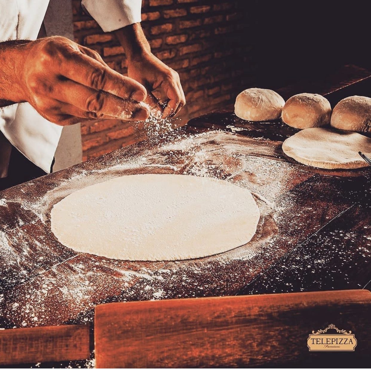
Telepizza Premium
We love Telepizza Premium’s watermark. We usually don’t recommend adding watermarks to the top left corner or bottom right corner, since this is typically where our eyes go first to “read” an image. However, in this case, the watermark is small – but still big enough so people can see it – and it also complements the colors of the image. Because they chose an image that is really eye-catching, the watermark is the last thing your eyes see… just how it should be!
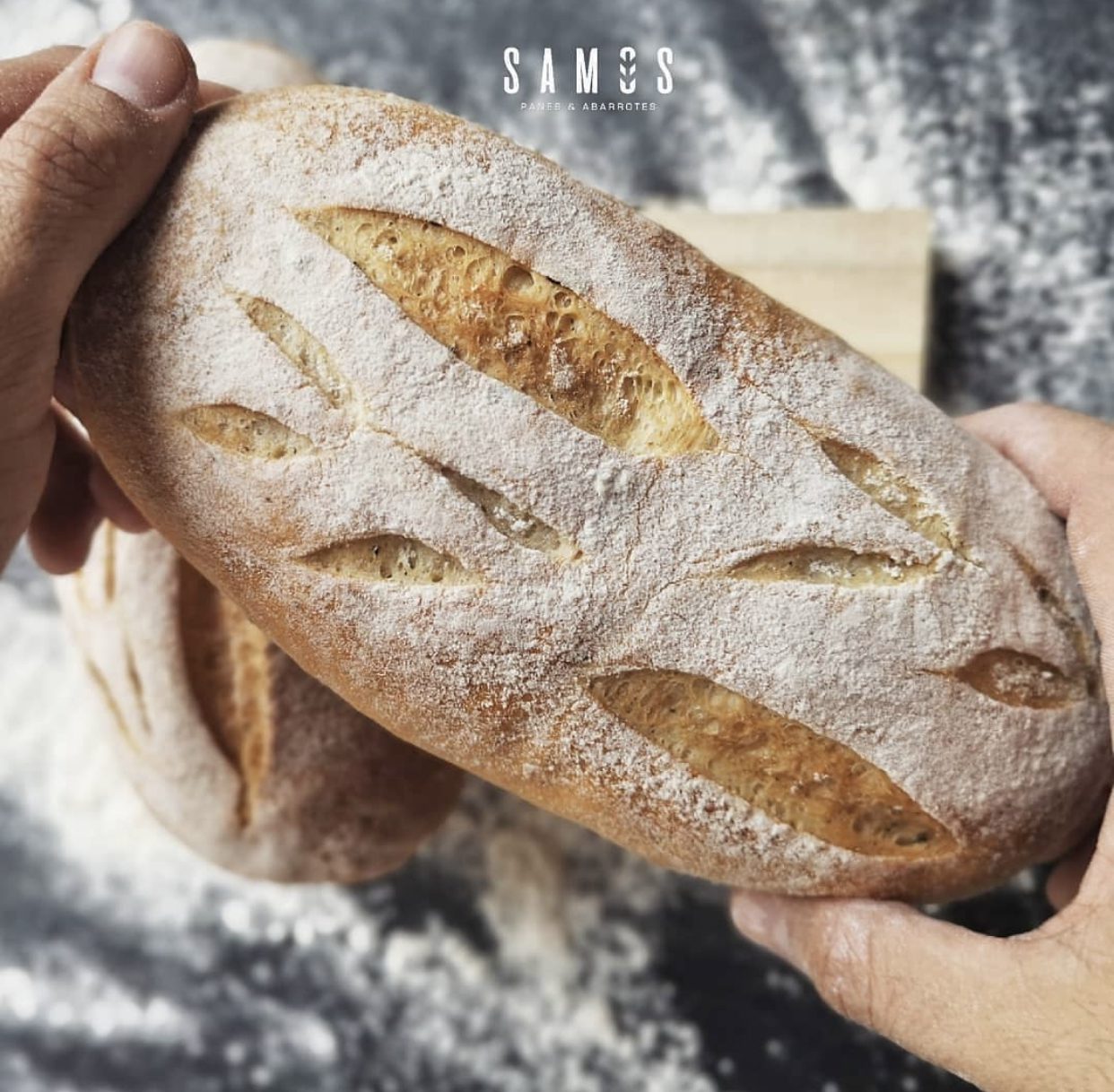
Samos Panes y Abarrotes
For us, Samos Panes y Abarrotes‘ watermark is the absolute best. We love the logo, but everything about it is actually very good. The placement is ideal because it doesn’t draw too much attention, even though it’s at the top. It’s also not too big, but people will still be able to easily see it and identify where this post came from. The neutral color is discrete and it also matches the minimalist colors in this picture: beige, white, and gray. All in all, the watermark blends in perfectly with the picture and it looks fantastic!
Omelette Delice
Omelette Delice‘s photo simply makes my mouth water. But, we’re here to talk about the watermark. My favorite thing about their watermark is that it’s simple and discreet, which brings all my focus onto that delicious photo. If I had to be critical of anything, I would say that it is still a little big, but the elements are very thin and minimalist, so it actually doesn’t cover up too much of the picture underneath.

Nastya Lollipop Bakery
Nastya Lollipop Bakery is also doing a great job of strategically placing their watermark on their photo. It doesn’t cover anything and really allows the audience to look at the picture without being distracted by the watermark. The fact that it’s white – which is also the color of the background – makes it so much more discreet even though it’s pretty big compared to the cake. The picture allows you to have some space to “breathe” and the watermark fits perfectly. When you’re taking your photos, try to think about where you’re going to place your watermark so that you can mimic this great placement.

Read more: How to Take Product Photos with Your Smartphone
Did you like these tips?! Then don’t forget to save the image below in your “Watermark Ideas and Tips” board on Pinterest! Also, check out our Pinterest page and follow us to get daily updates + digital marketing and social media tips for small businesses!

We can’t wait to see what you do. Please tag us using the hashtag #GrowingMyBiz so we can see and share your work!